When it comes to monitoring your smart home, there are a lot of options out there on how to do it. You can use tools like Prometheus or Home Assistant with all of its various integrations, you can use Grafana, InfluxDB, or you can use a mix of all of them. I recently set up a configuration using InfluxDB, Home Assistant, and Grafana to monitor my smart home, and while it was a lot of work to get up and running, the payoff was worth it.
I set up everything in TrueNAS, using the official images for all of these applications, and I deployed Telegraf on my Mac to pull data into InfluxDB. All of the data is then read from InfluxDB into Grafana, and I write my queries in InfluxQL. The result is a beautiful dashboard that can show me graphs in real time of different aspects of my smart home.
Setting up InfluxDB and Telegraf
This is the hardest part
Setting up InfluxDB is undoubtedly the most difficult part of the entire process, especially with the changes to how InfluxDB works in version 2.0. Basically, InfluxDB changed from accepting all different kinds of formats to allowing one specific format, with the justification for that being that it minimizes what InfluxDB needs to support. It only supports data in Telegraf format, which means you can no longer use the likes of Graphite or SNMP. It’s ultimately a good change, but it means that a lot of information you’ll find online is outdated. During the setup process, you’ll be shown an API token. Make sure to save it somewhere safe, as it’s an incredibly important token that you’ll use again and again.
Installing the container and configuring my organization and account was the easy part, but figuring out how to get Telegraf working was the part that I struggled the most with. In my case, once I added a Telegraf device to InfluxDB, it gave me my API token and a command to run in my terminal to start sharing data. The command was the following:
telegraf --config http://192.168.1.5:30115/api/v2/telegrafs/0e9f980bb8fdd000
However, this failed to work. Once I used wget to pull the file and inspect it, I saw that it was sharing data to 192.168.1.1, or my default gateway, which was obviously incorrect. I modified the config to add CPU information collection and changed the IP address to 192.168.1.5. I then re-ran the command but pointed it to my local configuration that I had downloaded and modified. This worked just fine, and I was collecting data from my Mac.
If you want to see the list of plugins from which you can collect data, check out the official Telegraf GitHub. Every plugin has a default configuration that you can just copy and paste the contents of into your overall Telegraf configuration file, and that data will then be shared automatically with your InfluxDB server. You can already inspect it and make dashboards in InfluxDB if you want, but I wanted to move everything over to Grafana.
Next, I set up Home Assistant to export my data to InfluxDB as well. Home Assistant’s integration is a legacy integration, meaning that it’s only controlled via a YAML file. You’ll have to modify your Home Assistant configuration.yaml file and add the configuration for InfluxDB2. You can find the instructions on how to do that and what you need to add depending on your setup here. The steps you need to take to modify that file will differ depending on how you run Home Assistant.
Once you’ve configured everything and you can see your data is showing up in InfluxDB, you’re ready to move over to Grafana.
Setting up Grafana
Pulling all of your data over
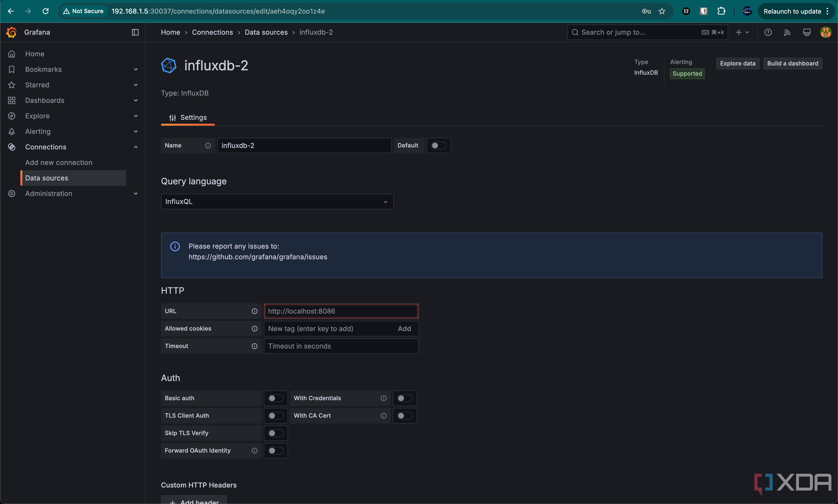
Getting Grafana up and running is comparatively easy, as you just need to point it at InfluxDB. In Grafana, go to Data sources and search for InfluxDB, add it, and then fill out the connection details for InfluxQL. The details you need are:
- URL: This is the address that you use to access InfluxDB
- Database: This is the name of the organization
- Username: Your username
- Password: The API token you received when you set up InfluxDB
Everything else can be ignored, so click Save & test. It should successfully connect, and you can now start creating your graphs.
Creating your first dashboard
Making pretty visualizations
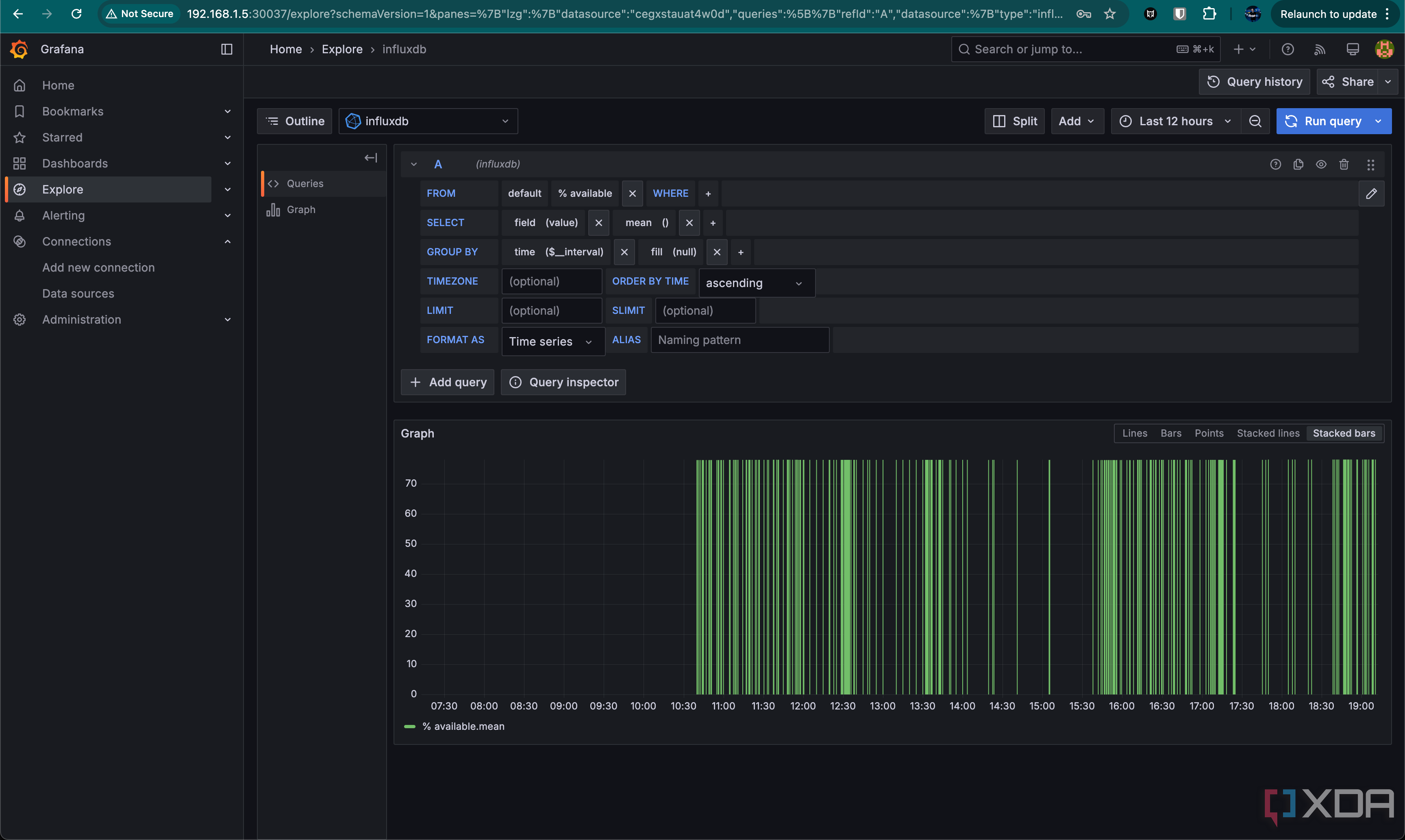
There are a ton of different templates out there for Grafana to make your own dashboard, but we’ll make some basic ones so you can get to grips with making your own. Go to the Explore tab on the left to get started.
Grafana uses a query builder when you use InfluxQL so that you can just click and select different objects that you want to read from, rather than needing to know how to write all of the queries yourself. We’re going to make the storage percentage graph that I’m using in my current dashboard, which pulls data from my Mac with Telegraf and passes it to InfluxDB, which is then read by Grafana.
In the query builder, you can select what you want to read, from where, and add filtering conditions to it. In this case, it’s relatively simple, as I just need to read the “% remaining” field, as my Mac is the only device reporting. If I had other devices reporting, I would also need to specify the device.
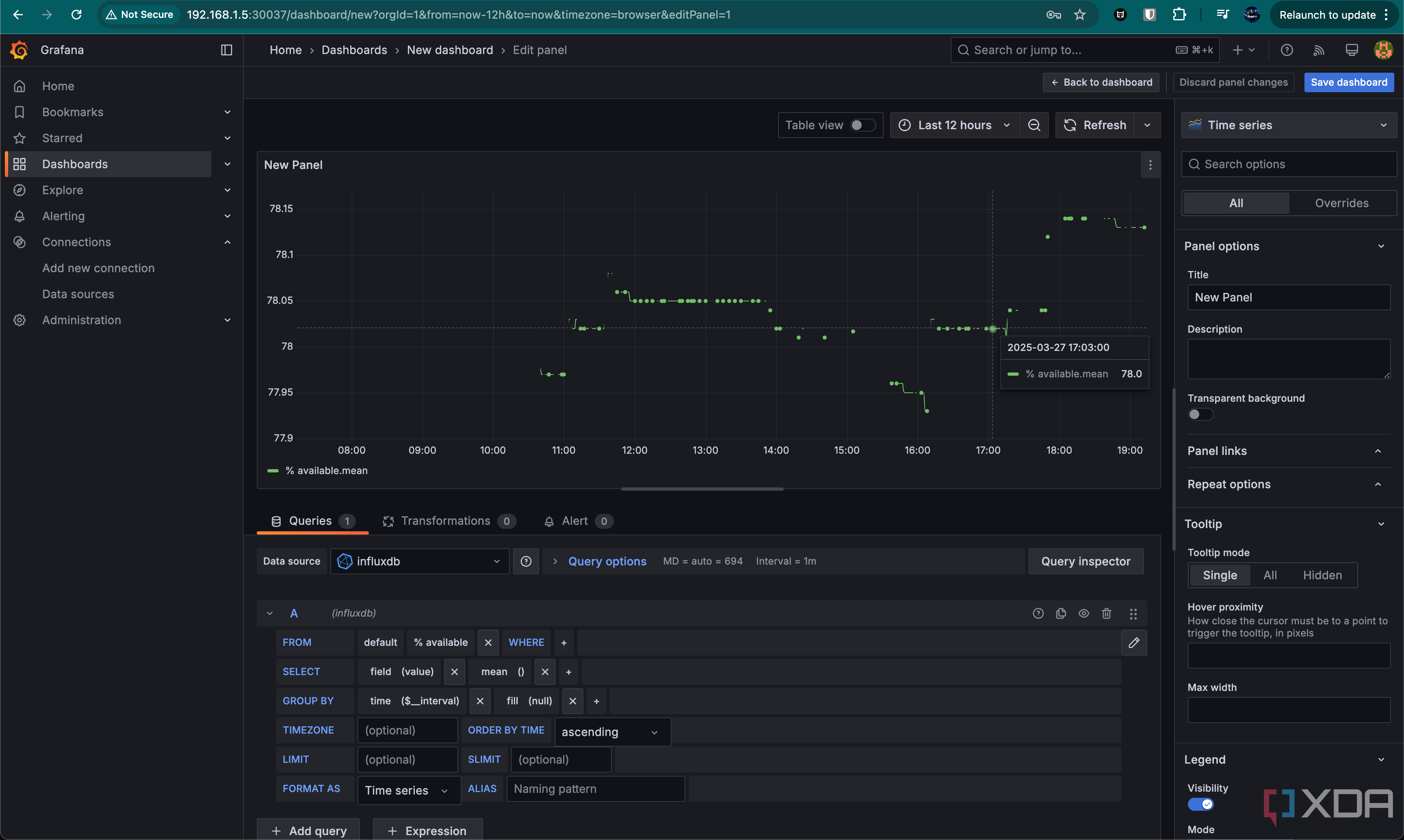
This will work for now, so at the top, click Add, and add it to a new dashboard. Give your dashboard a name if prompted, and you should be on a page with the graph in the top left. We’ll now modify the graph that’s been added by hovering over it, clicking the three dot menu in the top right, and clicking Edit.
Right now, all it shows are the exact value readings that it took at specific times of the amount of storage left on my Mac. It’s not exactly pretty to look at, but we’re going to change that. In the top right, click Time series and you’ll be faced with a ton of other options. Change it to Gauge, and it already looks significantly better.
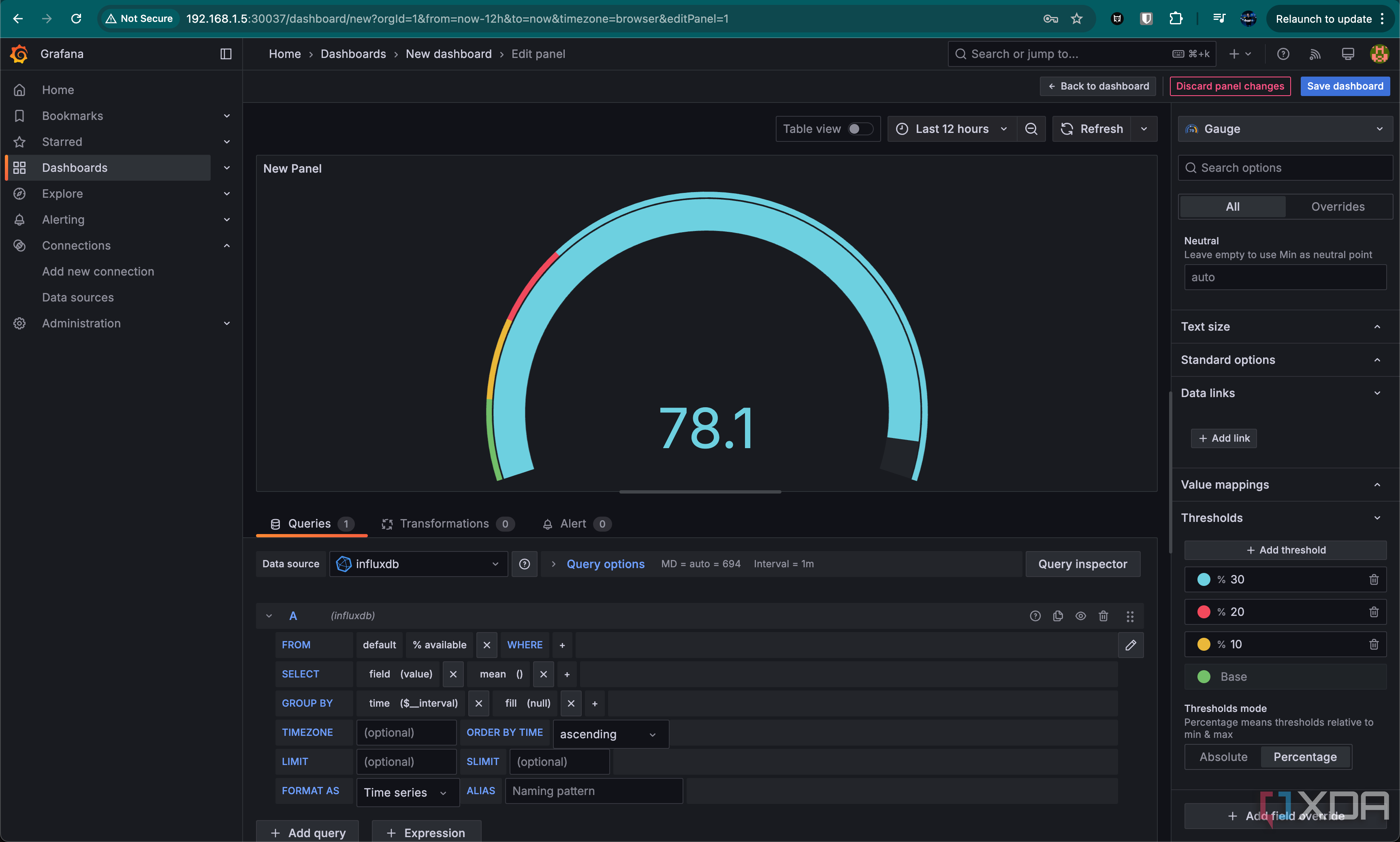
With this, you could set a title and this would be a perfectly usable graph to have on your dashboard, but we’re going to make a slight change so that it looks even better. Scroll down on the right-hand side menu and go to thresholds. Change it from Absolute to Percentage, and change the percentage value. I changed it to 10%, 20%, and 30%.
This works, but there’s a problem; the colors should probably be swapped, right? It works by reading the colors we have assigned to it, and the dominant color of the gauge is selected by where in the threshold we fall.
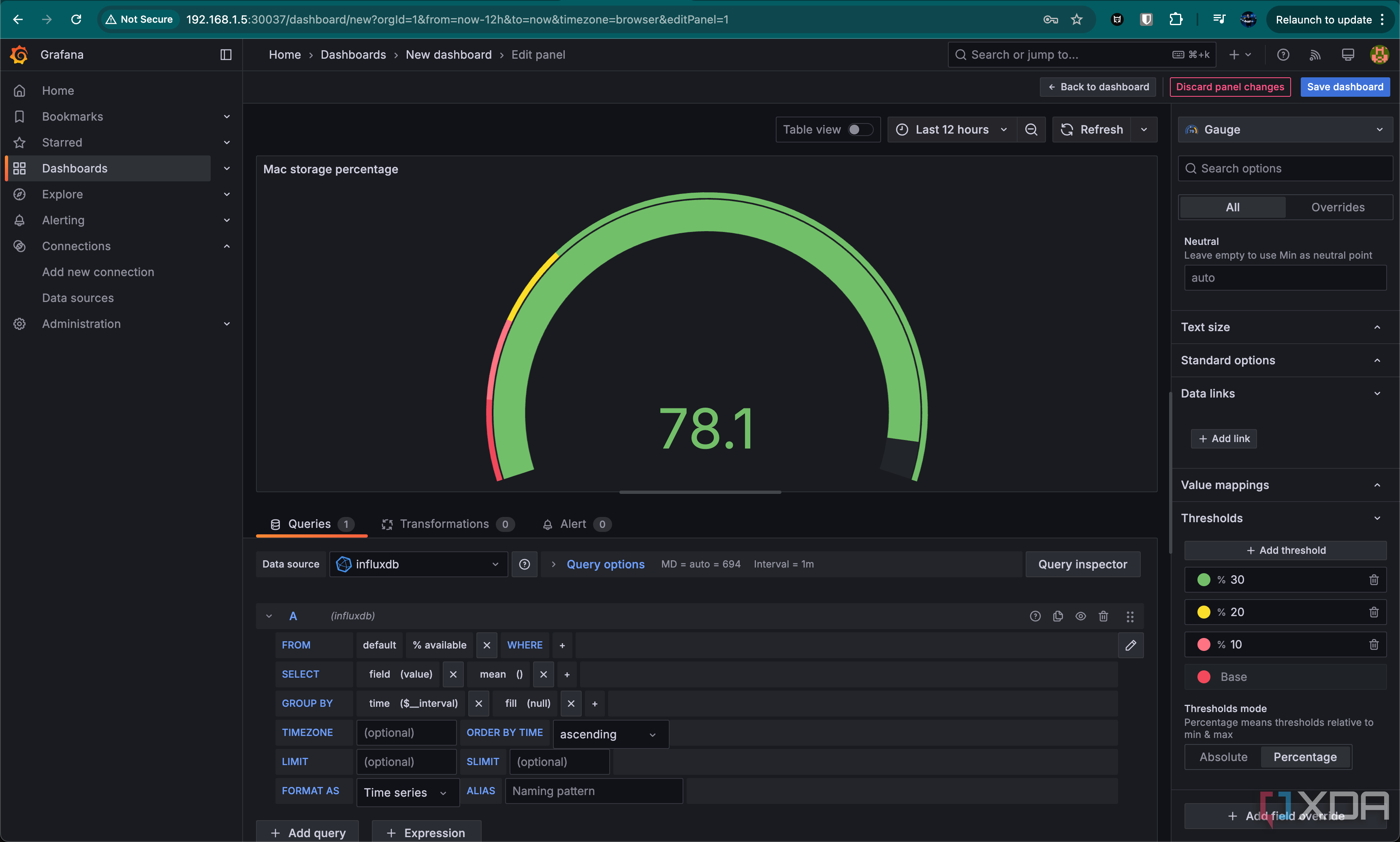
Thankfully, this is a pretty easy fix! Click the color icon beside each percentage, and just go through them, swapping the order. Your gauge will now be green (assuming you’re above the 30% threshold), and the colors representing the percentages will now feel more natural.
Data visualizations can be incredibly useful
See everything at a glance
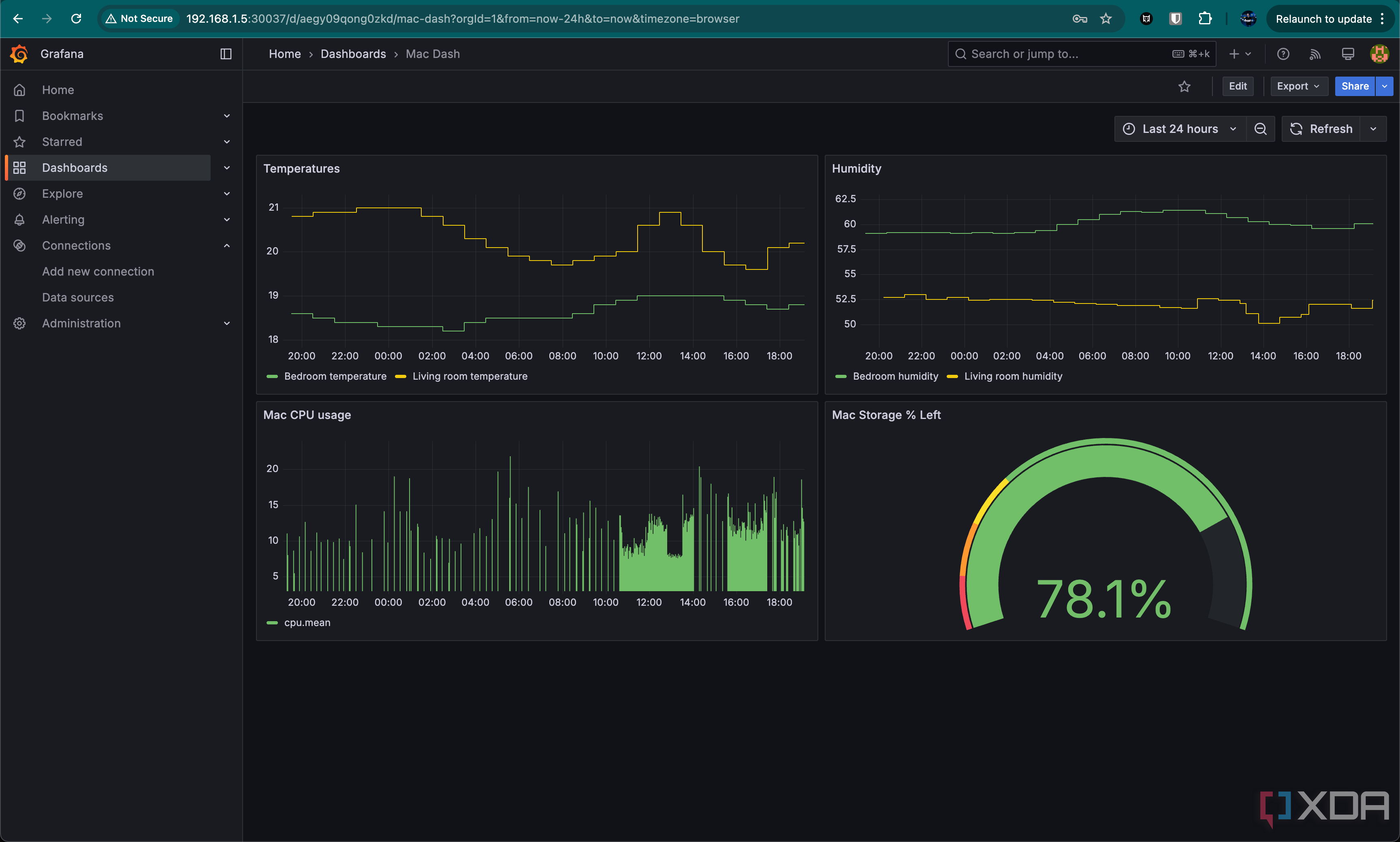
Even though this is a fairly rudimentary graph, there are countless dashboards out there designed to accept all kinds of input data to visualize your smart home. I’ve been going all in on Home Assistant recently, picking up some sensors and ordering some more online. I can feed all of the data into InfluxDB and read it out with Grafana to make my dashboards, and they look fantastic. I have a more sophisticated dashboard than a single graph, though it’s still rudimentary and I’m in the process of expanding it.
Personally, I’d lean more towards a Home Assistant dashboard for most of my visualization, but the power that Grafana gives is practically unmatched. There’s just so much you can do with it, and it’s a rewarding system to get set up and working once you do. Sure, different services can be finicky, but you get a lot of control. You can even set up an API key in Grafana so that Home Assistant can read from it, and then add your graphs as a camera object in Home Assistant to be displayed on your dashboard. While Home Assistant can graph your data for you, Grafana gives you significantly more options.
No matter what, though, I highly recommend setting up some kind of visualization service for your smart home. You can see everything in one place, and you can set alerts through the likes of Home Assistant if something is wrong. I currently get a notification if the humidity goes too high, and I could pick up a Home Assistant-integrated dehumidifier if I wanted to automate the process entirely.
Smart homes are a rabbit hole, but they can be an incredibly rewarding one to go down once you get started.

